
While working at Capitola as the sole UX/UI designer, I developed the I amsterdam app from the ground up. This included conducting user research, creating wireframes, and designing the full user interface to ensure a seamless and engaging experience.
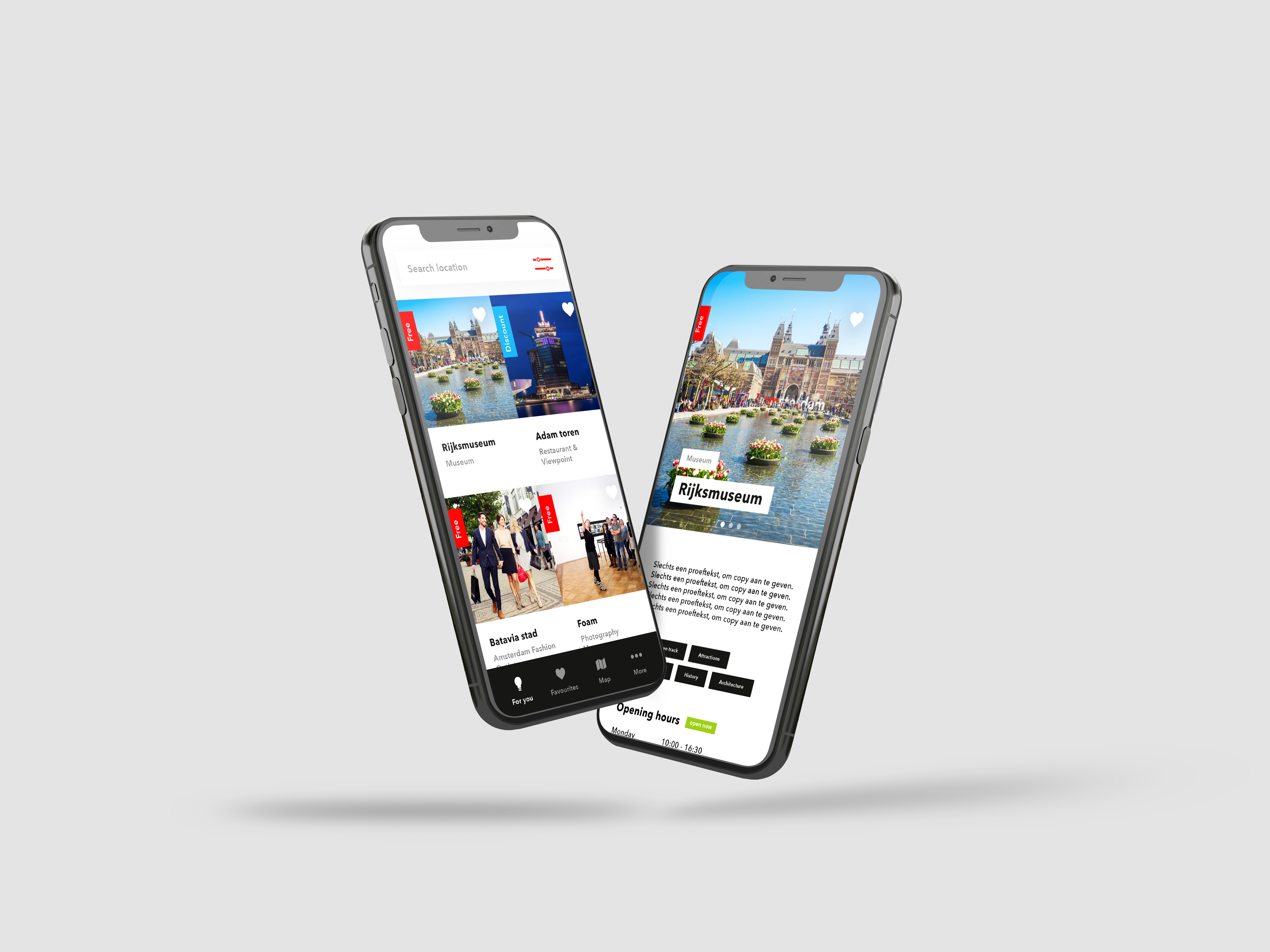
The I amsterdam City Card app helps tourists explore the best of Amsterdam with ease. From museums and attractions to public transport and hidden gems.
Attraction Guide Discover and access top museums, galleries, and more 🎨.
Public Transport Navigate the city like a local with unlimited public transport 🚆.
Exclusive Deals Unlock special offers at restaurants, shops, and attractions 🍔🛍️.
Personalized Itineraries Plan your perfect day based on your interests 🗺️.

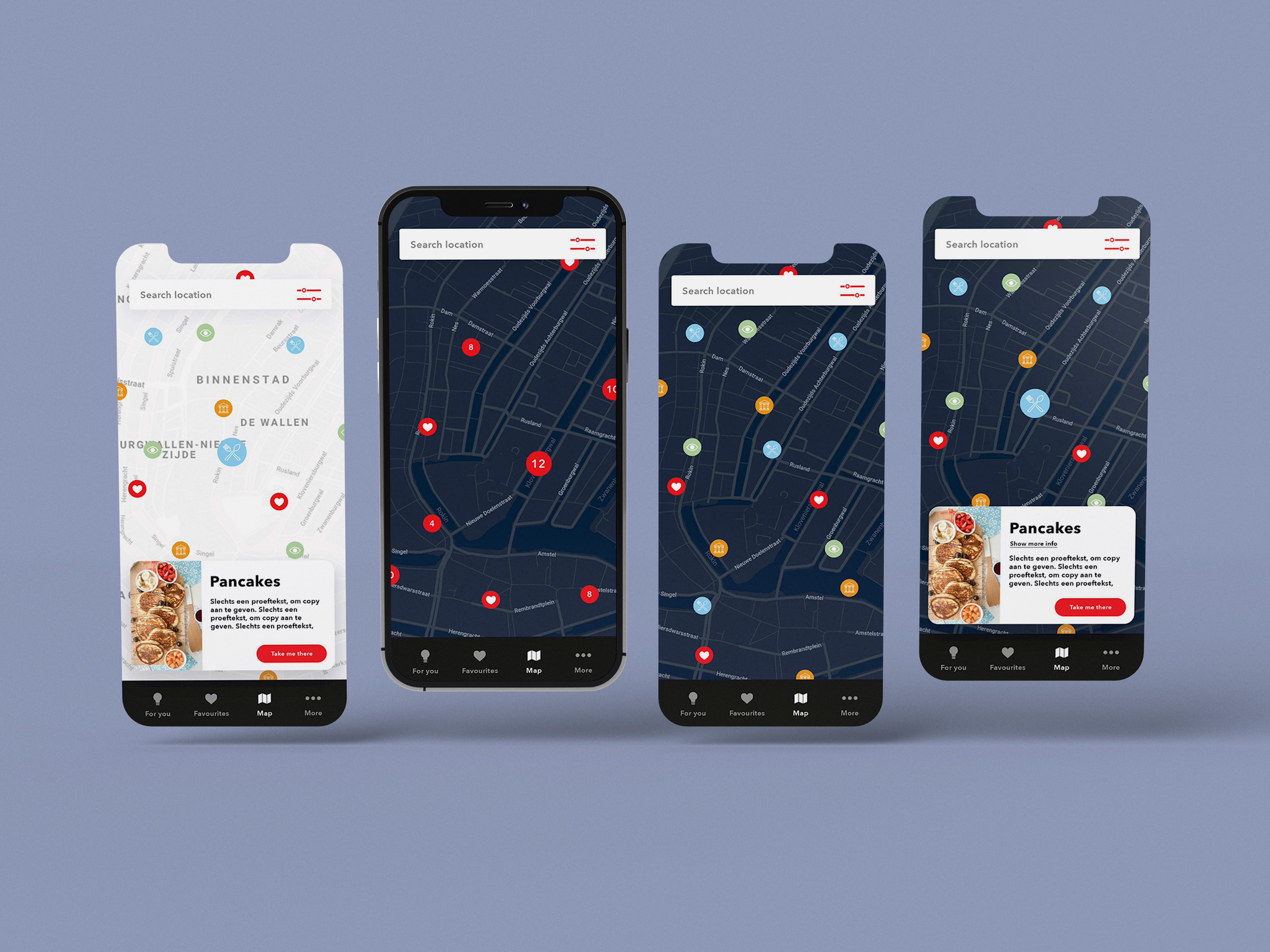
For the I amsterdam City Card app, I designed a structured map that organizes locations into clusters when zoomed out. This approach ensures a clean and intuitive experience for users, helping them easily navigate the city without being overwhelmed by too many points of interest at once. When zooming in, the clusters expand to reveal individual locations, allowing for a more detailed view as needed. This provides a smoother and more user-friendly exploration of the city’s attractions.
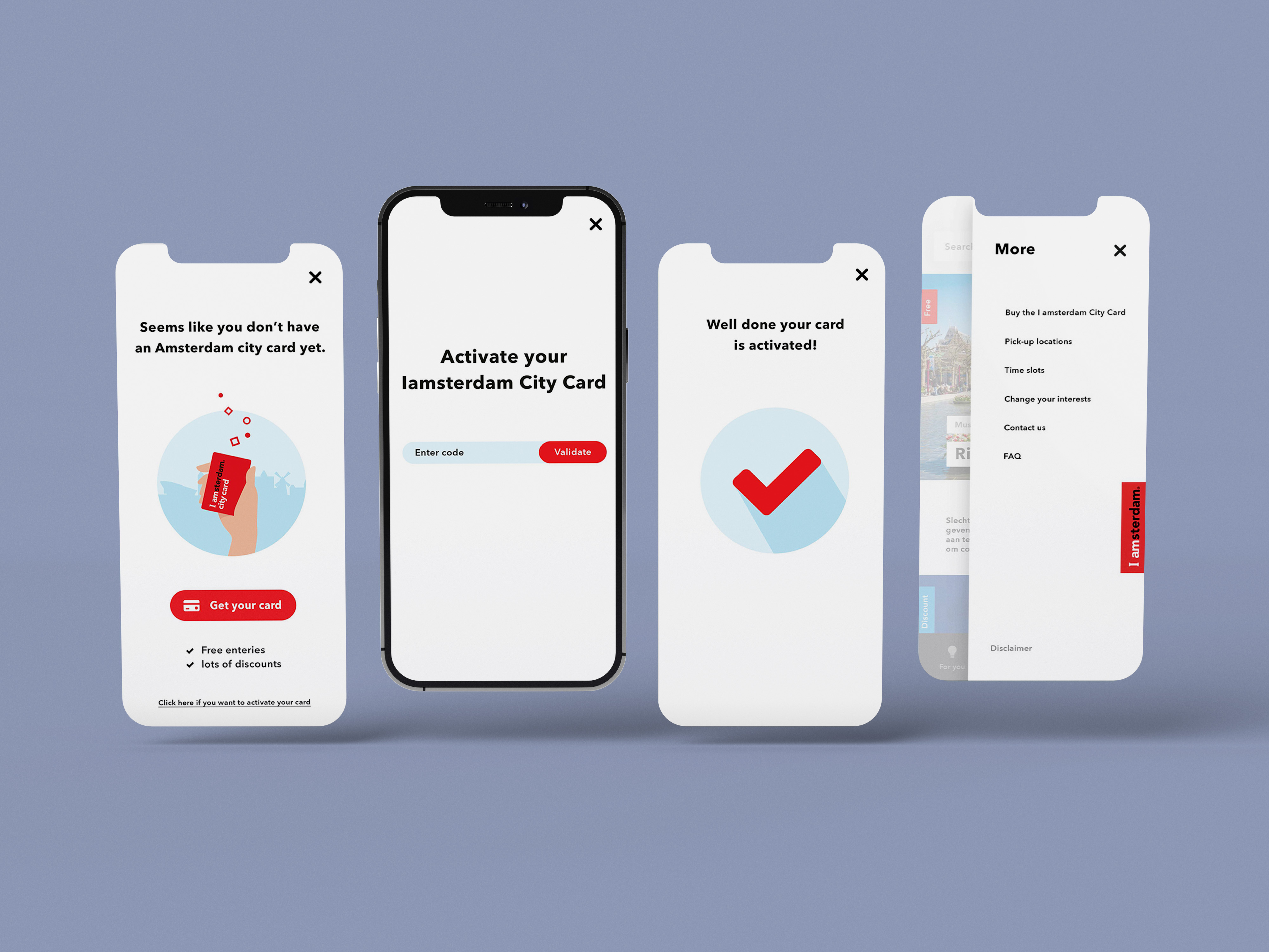
Additionally, I implemented both dark and light modes for the app to enhance accessibility and usability. The light mode offers a bright, friendly interface perfect for daytime use, while dark mode reduces eye strain in low-light environments, improving comfort during evening or nighttime exploration. Offering both modes also ensures the app accommodates user preferences, providing flexibility for all users and extending usability across different lighting conditions.
To better understand and address the needs of this varied audience, I developed detailed persona profiles. These personas served as valuable tools for analyzing user behaviors, preferences, and pain points. By leveraging these insights, I was able to prioritize key features and functionality for the app. For example, the personas helped clearly define both the "must-haves" and the "nice-to-haves," ensuring that the app not only meets essential user expectations but also offers additional features that enhance the overall user experience. This user-centered approach was crucial in aligning the app’s design with the real-world needs of its diverse user base.
To gain further insights, I created a customer journey map. This map outlines how customers make contact, their thoughts while considering the purchase, and the effort required at each step. It also highlights the "pain points" encountered during the process. Based on this information, numerous design opportunities arise to make the app as user-friendly as possible.


